


About Okada App
WHY THE NAME OKADA?
"OKADA" it's a term widely used and understood in Nigeria for commercial motorcycle transport. This makes the app's name straightforward and familiar to the intended users from all part of Nigeria, especially in the western part of the country.
WHY OKADA APP?
In response to the evolving challenges within Nigeria's transportation sector, the Okada app emerges as a solution tailored to the unique dynamics between motorcycle commercial riders (Okada) and passengers.
In response to the evolving challenges within Nigeria's transportation sector, the Okada app emerges as a solution tailored to the unique dynamics between motorcycle commercial riders (Okada) and passengers.
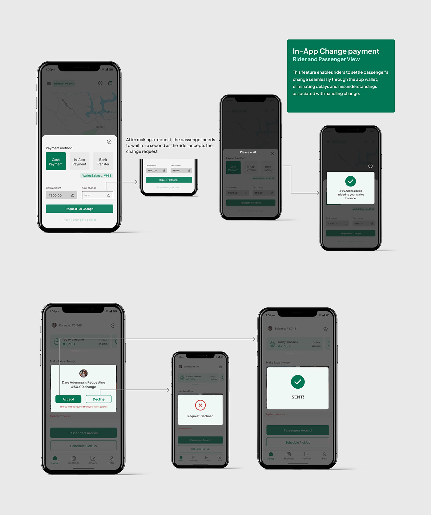
The app's development was fueled by a commitment to enhancing the overall experience of both riders and passengers, addressing contemporary issues such as wait times, fuel inefficiency, insecurities, recklessness of riders and the everlasting 'No change' problem.
The app seeks to bridge the gap between traditional transportation methods and the modern, technology-driven solutions. It's not just a convenient tool for commuting; it's a reflection of adaptability, innovation, and a commitment to improving the daily lives of Nigerians in the bustling landscape of transportation.


Visual Identity
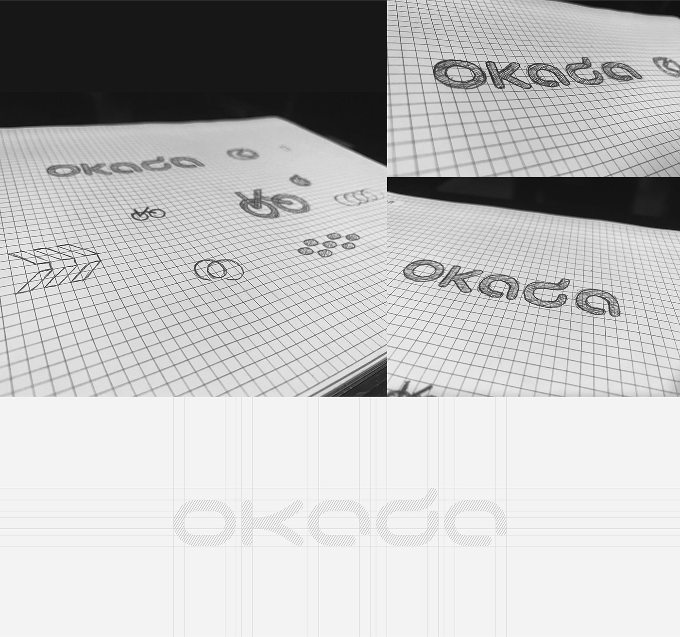
THE LOGO RATIONALE
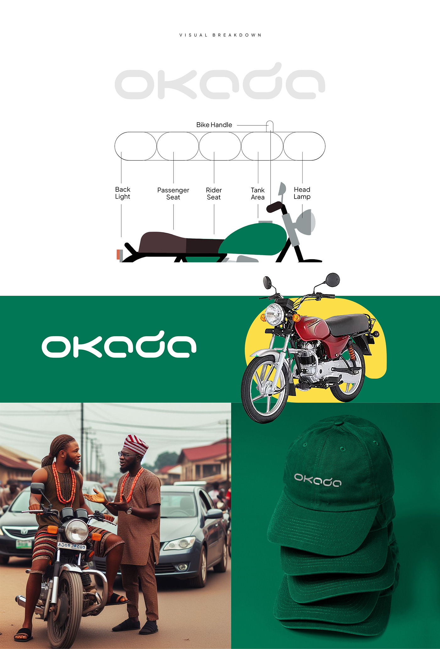
The wordmark logo for the "Okada App" is designed to visually represent the essence of commercial motorcycle transportation in Nigeria, seamlessly integrating each alphabet to symbolize key elements of a side view of a motorcycle. The design captures the distinctive features of a motorcycle, creating a unique and memorable visual identity for the brand.
o- Rear Light:
The letter "o” is strategically placed at the beginning of the wordmark to symbolize the rear light of a commercial motorcycle. Its circular shape with rounded edges mirrors the design of a typical rear light, providing a recognizable starting point for the logo.
The letter "o” is strategically placed at the beginning of the wordmark to symbolize the rear light of a commercial motorcycle. Its circular shape with rounded edges mirrors the design of a typical rear light, providing a recognizable starting point for the logo.
k - Passenger Seat:
The letter "k" is artfully shaped to represent the passenger seat. Its oblong form and rounded edges mimic the contours of a typical motorcycle seat, emphasizing the importance of accommodating passengers in the transportation service.
The letter "k" is artfully shaped to represent the passenger seat. Its oblong form and rounded edges mimic the contours of a typical motorcycle seat, emphasizing the importance of accommodating passengers in the transportation service.
a - Rider Seat:
The letter "a" is crafted to symbolize the rider seat, positioned after the passenger seat. The elongated and rounded design mirrors the shape of a motorcycle seat, representing the rider's space and the central element of the vehicle.
The letter "a" is crafted to symbolize the rider seat, positioned after the passenger seat. The elongated and rounded design mirrors the shape of a motorcycle seat, representing the rider's space and the central element of the vehicle.
d - Tank Area and Handle Extension:
The first instance of the letter "d" is used to depict the tank area of the motorcycle. Its rounded shape and oblong structure capture the essence of the motorcycle's fuel tank. The extension of the letter "d" is cleverly shaped to represent the handlebars, emphasizing the control and navigation aspect of the commercial motorcycle.
a - Headlamp:
The final letter "a" is strategically placed at the end of the wordmark, symbolizing the headlamp of the motorcycle. Its rounded and elongated form reflects the shape of a typical motorcycle headlight, serving as a visual endpoint that completes the representation of the side view.
The final letter "a" is strategically placed at the end of the wordmark, symbolizing the headlamp of the motorcycle. Its rounded and elongated form reflects the shape of a typical motorcycle headlight, serving as a visual endpoint that completes the representation of the side view.
Overall, the wordmark logo is a thoughtful integration of each alphabet to visually communicate the core elements of a commercial motorcycle, capturing the essence of the brand's connection to the traditional Okada transportation while signaling innovation and modernity through its rounded and stylized design. This unique and creative representation aims to make the logo instantly recognizable and memorable to the target audience.


Summary & Problem Solved
With this innovative solution, the app serves as a bridge between traditional transportation and modern technology. Bike riders can effortlessly navigate and locate passengers in their vicinity, saving them time, stress, and fuel. This precision enhances their work, and the app provides them with the opportunity to earn extra income through their regular daily activities.
It also eliminates the vulnerability of roadside accidents of passengers, saves time, ends argument on payments and cash issues and lateness to work or other destinations. Lastly it provides passengers with a quick safety precaution in case of distress.

TEAM
Victor Ajala
Art Direction & Brand Identity Design
avstudiosng17@gmail.com
Israel Ajala
UX/UI Design
ajalaisrael2015@gmail.com
ajalaisrael2015@gmail.com
Lawal Jameel
Motion Design
lawaljameel5@gmail.com
lawaljameel5@gmail.com


